In a world that seems to operate almost entirely on screens, it is easy to fall into the trap of thinking that your digital presence is the only thing that matters. But I’ve learned over years of working with diverse businesses that the moment a potential client steps away from the computer, your physical brand takes over. Whether it’s a business card handed over at a networking event or a brochure sitting in a lobby, these tactile touchpoints tell a story about who you are.
When a customer holds something you have produced, they are subconsciously judging the quality of your services based on the quality of that paper. I have seen brilliant companies lose credibility simply because they tried to cut corners with flimsy handouts or mismatched colors. At Laguna Digital, we often remind our clients that print is not just a utility it is the physical embodiment of your brand’s promise. If your print materials feel cheap, your brand feels cheap.
The Tactile “Handshake”: Business Essentials
There is a distinct difference between a business card printed on a standard office laser printer and one produced on high-quality cardstock with a matte or gloss finish. The former gets thrown away; the latter gets kept. Your stationery is often the first “handshake” your brand has with a customer when you aren’t in the room. If the edges are perforated or the ink is smeared, it signals a lack of attention to detail.
Investing in high-quality business essentials creates a cohesive narrative. From your letterhead to your envelopes, every piece of paper that leaves your office should look like it belongs to the same family. We have worked with clients who were amazed at how much more seriously their invoices were taken simply because they upgraded from generic layouts to branded, professional forms. It subtly enforces that you are an established, legitimate operation.
Color Consistency Builds Trust
One of the most common frustrations business owners face is the “Frankenstein” effect—where their logo looks royal blue on the website, purple on a flyer, and navy on a business card. This happens because screens use RGB light, while printers use CMYK ink. Without professional calibration, your brand identity becomes fragmented. A professional partner ensures that your specific shade of “brand blue” remains consistent across every medium.
This consistency is vital whether you are running a small run of flyers or a massive direct mail campaign. Modern digital printing technology allows us to hit those specific color targets with incredible accuracy, even on short deadlines. Additionally, for internal documents or client presentations, utilizing professional copying services ensures that high-volume jobs don’t suffer from the fading toner or streaks that plague typical office copiers.
Visibility and Authority: Signs and Banners
Have you ever walked past a storefront or a trade show booth where the banner was pixelated or the text was hard to read? It immediately lowers your perception of that company’s competence. Large-format printing is unforgiving; flaws that are invisible on a laptop screen become glaringly obvious when blown up to six feet wide. Your signage is often the loudest voice in the room, and it needs to speak clearly.
We advise clients to treat signs and banners as long-term assets. Using the right materials—like weather-resistant vinyl for outdoor use or non-glare finishes for indoor events—ensures your message survives the elements and the lights. A crisp, professionally mounted sign suggests stability and permanence, reassuring customers that you are here to stay.
Establishing Expertise Through Printed Content
There is a resurgence in businesses using physical books and manuals to demonstrate authority. A PDF guide is useful, but a bound book carries weight—literally and figuratively. Consultants, coaches, and educational institutions are increasingly printing their own training materials and thought leadership books. It separates them from competitors who only offer digital downloads.
I’ve written extensively about this in my previous blog on Book Printing, but it bears repeating: the binding and cover finish of your publication reflect the value of the content inside. Whether you are producing a spiral-bound employee handbook or a perfect-bound memoir for a client, the physical durability of the item matters. Our book printing services focus on creating products that feel like they belong on a bookstore shelf, not just in a recycling bin.
Precision in Technical and Creative Industries
For some industries, print quality isn’t just about marketing; it is about operational accuracy. Architects, engineers, and construction professionals rely on blueprints that are free of smudges and distortions. A brand identity in these fields is built on precision. If a contractor is working off a set of plans where the fine lines are blurred, it reflects poorly on the firm that drafted them.
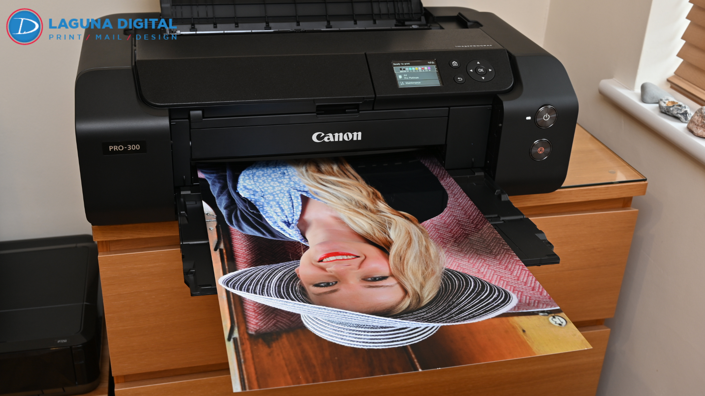
Similarly, artists and photographers rely on print to represent their vision faithfully. If you are decorating your office or selling prints, art reproduction and photo printing must be archival quality. Faded office art makes a workspace feel neglected, whereas vibrant, high-resolution imagery creates an atmosphere of creativity and success.
FAQs
1. Why can’t I just print my marketing materials at the office to save money?
You certainly can for internal drafts, but office printers generally lack the ability to print “full bleed” (printing to the edge of the paper) and cannot handle heavy cardstocks. The result usually looks homemade. The small savings are often outweighed by the cost of looking unprofessional to a prospective client.
2. How does paper weight affect brand perception?
Paper weight (measured in pounds or GSM) communicates value. A flimsy flyer feels disposable, while a heavy, rigid postcard feels like a premium offer. We often recommend heavier stocks for items you want the client to keep, like business cards or presentation covers.
3. What is the difference between RGB and CMYK, and why does it matter?
RGB (Red, Green, Blue) is how computer screens display color using light. CMYK (Cyan, Magenta, Yellow, Key/Black) is how printers produce color using ink. If you don’t convert your files correctly, your bright screen colors can look muddy in print. Professional printers manage this conversion to keep your branding vibrant.
4. Is print still relevant for online businesses?
Yes, perhaps even more so. Because our inboxes are flooded with spam, receiving a high-quality physical mailer or a beautifully packaged product with a printed thank-you card stands out. It creates a memorable “unboxing” experience that digital-only brands often lack.
Conclusion
Your brand identity is the sum of every interaction a customer has with your business, and print remains one of the most powerful ways to control that narrative. From the texture of your business card to the clarity of your banners, these physical details build a foundation of trust that digital pixels simply cannot match.
It is about showing your customers that you care enough to invest in quality. If you are ready to ensure your print materials reflect the true value of your business, contact us today to discuss your needs. For more insights on design, marketing, and print technology, feel free to explore our blog.

Discover Modern Comfort: A Guide to Apartment Rent in Beirut
Beirut, the lively capital of Lebanon, is a city that blends deep-rooted history with a mo…


Discover Modern Comfort: A Guide to Apartment Rent in Beirut
Beirut, the lively capital of Lebanon, is a city that blends deep-rooted history with …